Exercise using the font type: BEMBO
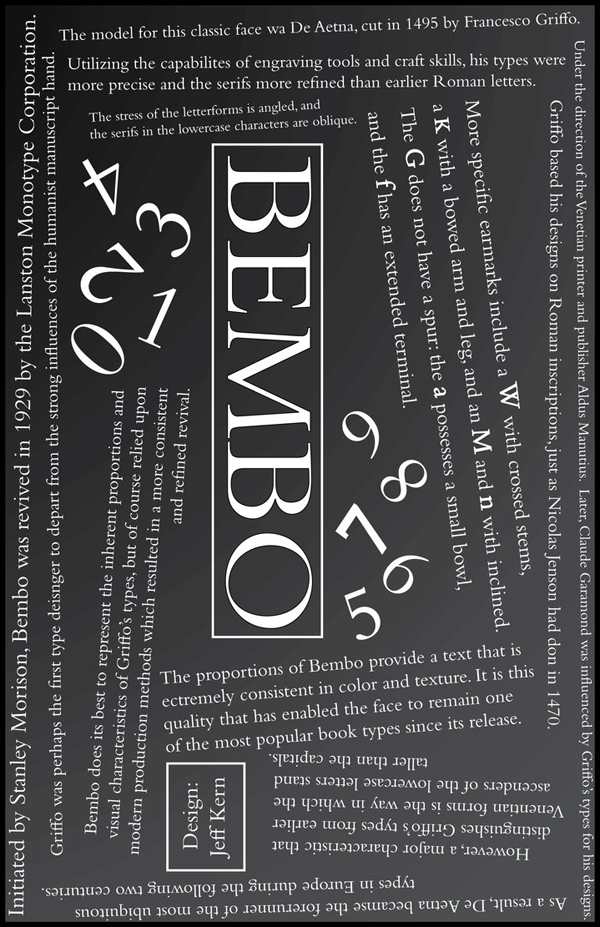
"Initiated by Stanley Morison, Bembo was revived in 1929 by the Lanston Monotype Corporation. The Model for this classic face was De Aetna, cut in 1495 by Francesco Griffo. Under the direction of the Venetian painter and publisher Aldus Manutius. Later, Claude Garamond was influenced by Griffo's types for his designs. As a result, De Aetna became the forerunner of the most ubiquitous types in Europe during the following two centuries.
Griffo was perhaps the first type designer to depart from the strong influences of the humanist manuscript hand. Utilizing the capabilities of engraving tools and craft skills, his types were more precise and the serifs more refined than earlier Roman letters. Griffo based his designs on Roman inscriptions, just as Nicolas Jenson had don in 1470. However, a major characteristic that distinguishes Griffo's types from earlier Venentian forms is the way in which the ascenders of the lowercase letters stand taller than the capitals.
Bembo does its best to represent the inherent proportions and visual characteristics of Griffo's types, but of course relied upon modern production methods which resulted in a more consistent and refined revival. The stress of the letter forms is angled, and the serifs in the lowercase characters are oblique. More specific earmarks include a W with crossed stems, a K with a bowed arm and leg, and an M and n with incline. The G does not have a spur: the a possesses a small bowl, and the f has an extended terminal.
The proportions of Bembo provide a text that is extremely consistent in color and texture. It is this quality that has enabled the face to remain one of the most popular book types since its release."
Fan made collage of all major Bad Religion albums
Various logos designed for the horror news website: DREAD CENTRAL (dotcom)
Fan cover for Silverson Pickups album "Swoon"


